Quantcast
Channel: Concepts Latest Topics
Viewing all 12191 articles
Browse latest View live

NBA 2K19 Concepts (feel free to add your own)

$
0
0

In honor of my hometown FINALLY being put into the game, I decided to bring up my concepts I've made for NBA 2k19. 

NyyX3XW.jpg


In my world, OKC moves to Ft. Worth (as well as the Clippers moving back to San Diego, which is next)...
 

2zE9T4R.jpg


This is what I came up with:


2PGBfM9.jpg


They play in "Bass Family Alley"
kS66imm.jpg


UleN0b8.jpg


The basics: 

 - The colors are supposed to be an altered garnet/grey/"Trinity blue". Kinda hard to get the colors down on the game. While changing the color of the name and numbers, it doesn't really translate to what you want, exactly

 - LOGOS: Primary is a basic roundel with the "FTW" insignia, which is based on the Fort Worth Cats minor league team. The alternates are the insignia and a panther head for "Panther City".

- Northwestern stripe is actually based on the city's fire trucks
 - the "corporate patch" is American Airlines, which is based here


And like I said, I'm doing the *San Diego* Clippers, next. But I'll post an alt. for Ft. Worth, which is another nice addition to this game. 


Unbranded Basketball Template

$
0
0

As you may have seen, I'm working in my Nationstates nation for some days. But during the day, while I'm at work, I don't have access to it. And in my job, after a huge amount of work, we sometimes have a "little-to-none work" day. This is the result of my "little-to-none work" day today. Still in early stages, without elaborated logos, patches, mesh or stunning details like jersey cuts. Some criticism is appreciated. When I have a final version, I plan to release it in a proper SVG or AI.


p8R7Xtx.png


The Principality of Lisander

$
0
0
Quote

Historic and Current National Team Uniforms

Ice Hockey

 Association Football Uniforms, Part 1 Part 2 Part 3

American Football

Baseball

Basketball


National Leagues

Basketball League (Old Concepts)


PqtuPnN.jpg


The Principality of Lisander is an environmentally stunning nation, ruled by Prince Johann Harmin with an even hand, and remarkable for its avant-garde cinema, pith helmet sales, and stringent health and safety legislation. The compassionate population of 10 million Lisanderians have some civil rights, but not too many, enjoy the freedom to spend their money however they like, to a point, and take part in free and open elections, although not too often. The national sport is Rugby Union, although national teams of Association, American and Australian Football, Volleyball, Cricket, Hockey, Basketball, Baseball, Rugby League, Autosports and even Lacrosse had some international appearances.


On this topic (which I hope is not misplaced, I decided to place it under Sports Fan Fiction because it's fictional, even if it is not a league), I'll start re-posting some old (current) stuff, and would like to gather some C+C to the uniform replacements, sooner or later. I will start with national teams, a round of C+C in each sport then the new uniforms. When the cycle of national teams is over, I plan to start the national leagues. Hockey, Association Football, Basketball and Rugby are the most advanced leagues, while Volleyball and American Football are only poorly planned, with only some teams imagined.


So, we need concepts. Let's start with a map (I hope this counts as a concept). Below, Lisander. An Island in the Atlantic Ocean, between Portugal and the United States. The map itself does not represent the cities itself, but the Communes (not related to communism. Equivalent to US Counties, based on Italian Comuni). Most of the communes only have one city, but some of them like Sirenia have more than one, and some cities even may span over more than one Commune, like Casterwill. The commune marked in red is Soria, the capital of the nation. Other big cities/communes are Despina, Sirenia, Kasandora and going up north, Lerna, Alix and Grandeville also have populations over 60,000 inhabitants. Most of the people concentrate in South, due to harsh temperatures in winter. Official Language is Portuguese (just because it's easier for me to manage), but English and French are also recognized and widely spoken over the nation. There are even some Irish out there.


C6VvEjb.png


Soon, I'll start gathering some old concepts, previously posted on this forum, as well as stuff posted only in NationStates Forum.

MLB x Nike Aeroswift - Arizona D'Backs (16/30)

$
0
0

After the announcement of Nike taking over the MLB in 2020 I wanted to start a new series, but given the multiple series relating the topic (all of them with great designs), I wanted to do something different.

This series will only feature full-colour alt uniforms, whose designs will be inspired by the style Nike is currently using for their soccer kits (that’s where the series title comes from).


Every team will use a pullover template, which tries to combine classic baseball uniforms with Nike’s Aeroswift style:


64M7Okx.png


The team list and order will be the following:

AMERICAN LEAGUE

Baltimore Orioles

Boston Red Sox

Chicago White Sox

Cleveland Indians

Detroit Tigers

Houston Astros

Kansas City Royals

Los Angeles Angels of Anaheim

Minnesota Twins

New York Yankees

Oakland Athletics

Seattle Mariners

Tampa Bay Rays

Texas Rangers

Toronto Blue Jays


NATIONAL LEAGUE

Arizona Diamondbacks

Atlanta Braves

Chicago Cubs

Cincinnati Reds

Colorado Rockies

Los Angeles Dodgers

Miami Marlins

Milwaukee Brewers

New York Mets

Philadelphia Phillies

Pittsburgh Pirates

San Diego Padres

San Francisco Giants

St. Louis Cardinals

Washington Nationals


I'll be posting new designs on a weekly basis, every Wednesday and Sunday. I hope you enjoy this series as much as I did designing the uniforms!

Current NBA Courts Tweaked

$
0
0

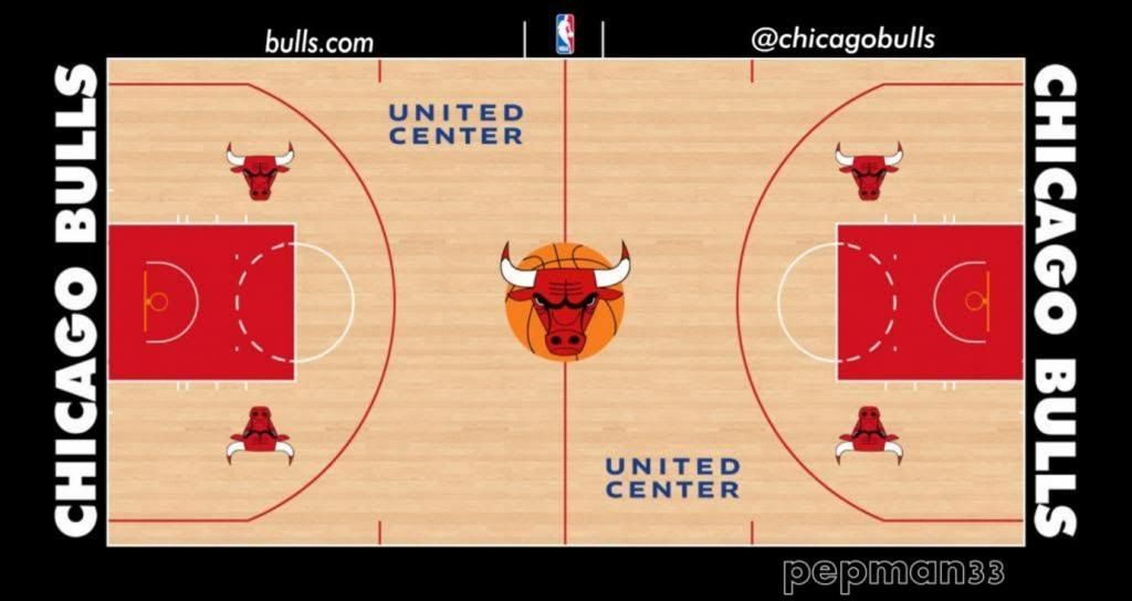
I mean the new court designs indicate a different look for the free throw line...check out the courts of Brooklyn, OKC, LA teams, Cleveland, etc.

Shout out to Weatherman for the courts! Nice work!

Source: http://boards.sportslogos.net/topic/89496-nba-courts/

Chicago

Bulls_zpscec4c263.jpg

EDIT 012814

Memphis

Grizzlies_zps804b68a3.jpg

EDIT 012814

Minnesota

TWolves2B_zpseb8b95f4.jpg

EDIT 022414

New York

NewYorkKnicks_zps57c102b0.jpg

Houston

HoustonRockets_zps3ec249bc.jpg

EDIT 020514

Miami

MiamiHeat_zpsde3f5c03.jpg

San Antonio

Spurs_zps0a277dcc.jpg

EDIT 012814

Sacramento

Kings_zpsea0704db.jpg

EDIT 012814

Alternative Football Universe: Premier Division (6/20: Portsmouth FC)

$
0
0
Hello everyone!


First I wanted to introduce myself, I'm PascalHugo and I am a designer. I wanted to create a football series, sorry soccer, across the Europe and maybe the world...
So let's start this! ( Yeah yeah I know, I try inspiration by Berlin Wall and Lafarge)


DEUTSCHE FUßBALL LIGA


ocs2f.jpg


The Deutsche Fußball Liga was founded in 1960, after the DFB and the DDR decided to create an unique championship for Germany. It's a merger of several regional championship across the two Germany. It was one of the Top 5 championship in Europe (England, Spain, Germany, Italy and France) and it's most unpredictable of all.

There are 20 clubs in the Deutsch Fußball Liga . During the course of a season (from August to May) each club plays the others twice (a double round-robin system), once at their home stadium and once at that of their opponents, for a total of 38 games.


NFL CONCEPTS IN MADDEN

$
0
0

OKAY Y'all,

sorry I haven't been doing anything on here recently, a lot of personal stuff and the introduction to modding madden 19 on PC has taken up my time I usually use for actual, substantial content that I could add to portfolios to send off to colleges and internships.


Sorry, I know you guys didn't come here for my life story.

 First up: Cleveland Browns

I'm really excited to show you guys that the Browns have been SO CLOSE to being a good look. It genuinely pains me that they could have a modern classic, but instead found value in giant wordmarks. All that is really needed is cut the sleeve stripe off at the damn sleeves, get rid of the different colored stitching, use that gorgeous number font as the focal point (as it should be), and extend the pants stripe all the way down. I know that sounds like 5 changes (which it is), but it really doesn't add up to a substantial difference.

5gMMD4c.png

z0GP10c.png

XiMtiL9.png

yERCFo6.png

(I did add a serif on the 5 so that it fit with the rest of the font, but that's the only thing i changed besides color and getting rid of the drop shadow)

 As always, I'll be doing more in the future, make sure to like, comment, subscribe, and visit my patreon. 

Variations on a Canuck by vtgco

$
0
0

Hello everyone, and Happy New Year!

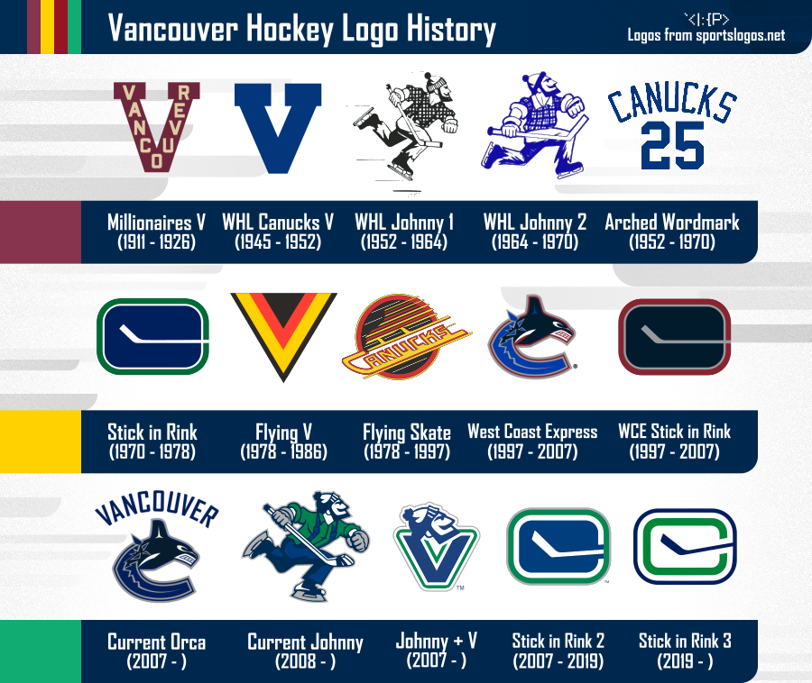
So there are lots of cool Seattle NHL concepts right now (yay!), but I thought I'd try my hand at our soon-to-be archrivals, the Vancouver Canucks!


As I'm sure you're all aware, Vancouver hockey has had a bazillion different identities. Here's an overview of Vancouver's hockey history for those who are unfamiliar:

logo_history_display.png


In this series, I'll try to combine or introduce different styles to some logos through their history.

The uniform template I will use is this Adidas template by Matthew McElroy.


Please enjoy, and let me know if you have any combo recommendations!


Fixing the Arizona Cardinals' Color Rush Uniforms

$
0
0

I thought that the Cardinals' Color Rush was kind of lazy to just slap black on there, so I decided to try and fix it.

-Added red facemask

-Arizona flag mark on the side of the sleeve. (already been done like a million times but it looks really good.)

-Changed the number outline

-Changed the pants outline.

C&C is appreciated!


https://imgur.com/tXXG6Yc

Revising Defunct NFL teams, the Sequel:Tawanda Kardex, Staten island Stapletons, Akron Pros.

$
0
0

A few years ago I did a number of concepts for defunct NFL teams. I'd seen a lot of concepts for modern teams and wanted to do something different. The results of the previous thread is here: https://imgur.com/a/P5PMx

When I did them I kept getting requests for the Tawanda Kardex and the Rochester Jeffs (and other teams) At the time I couldn't come up with concepts I was happy with. Now I do.


First up is the Tawanda Kardex. The team is famous for playing a grand total of one game in the NFL. Like a lot of local champions they simply weren't ready to play the better teams in the nation. At inception they were very similar to the Green Bay Packers. Local team, subsidized by local businesses made up of semi pro players. Difference is that GB had success early and Tawanda did not. Ironically, the company they were named after still exists. I started with the first name of the team, the Lumbermen. There is a high school team, the North Tawanda Lumberjacks. The high logo didn't really fit this project.


This is what I came up for a logo.
ANb4173.png

and this is what it looks like on a helmet.
5pUJuUY.png


"Kardex" was going to be a little more difficult. How do you make a logo using a typewriter? I tried just using the outline of a typewriter but it didn't fit. While driving it hit me to combine a T&K in old typewriter text with the outline of a football covering where they would overlap in the corner. What I came up with didn't work as a modern logo but it formed the basis for a modern descendant logo.


The Faux old time logo.
dUN9nrr.jpg


Here's the "Modern" logo on a helmet.
KWftUAa.png


Here's the Workspace where I figured out my ideas.
VQWs2hs.jpg


I'll work on unis later. First, I wanted to revisit a couple of the teams I did before.


A revised Dayton Triangles.
1lHwter.png

One of the ideas I had in making the designs was that somehow these teams had survived all the decades that in reality they didn't. It hit me that the team wouldn't keep such a dated logo during the 40's and 50's, 60's 70's etc... This is meant to be a Descendant of the original design, refined down to repeated triangle shapes within a larger triangle.


A revised Oorang indians.
pgZb6r0.png
I wanted to get rid of the feathers in the old design. It was too close to the Redskins and I wanted Native American iconography in the design. Tell me what you think.

Heavy's Expansion Concept thread

$
0
0

DISCLOSURE
Most of these are still in development and are not final, per suggestions mentioned in thread... also I used Paint, Paint.net, inkscape, 3d Paint.

That being said, welcome back to this section where I've been busy for months on end, creating concepts for teams that mostly exist in Madden and with some that I've come up with to fill the gaps of a hypothetical NFL expansion far into the future.

So lets begin

London Monarchs (NFC, switched to AFC, then returned to NFC)

The last time I did before taking all that time off was the original Monarchs team which is often used for Madden and is often referred to as the first World Bowl winner and is probably going to be the next destination for said expansion/relocation team so let's pretend that they are part of an expansion, what would their kits be like, long into the future... well worry no more.

HOME


4yE6TMCl.pngSPw5UwNl.png

ROAD

QUUpEC2l.pngYDeqe0al.png

ALTERNATE

sEwF2Ckl.png

So getting the obvious out of the way, there are two kits each for Home and Road... the first pair of Home and Kit are worn for seven games each where they change to the second pair... the alternate is worn for the two neutral games per season located in a neutral venue chosen by the league... big numbers, big NFL logo and player name ticks the boxes essentially.

Royal Blue goes well with Gold lettering which is what I learnt through experimentation
and it goes well opposite ways.... white shirts are the usual standard for road kits but for the first road I went gold pants to offset the r-blue whilst the r-blue pants go with the double gold as the second road.

The royal red is the alternate because in terms of colour, I was going for the British flag in reverse because I was avoiding to go to the team name that led the Monarchs to ruin... the England Monarchs.
?

Help with ideas for my league

$
0
0

So I am starting a fictional football league. The problem is, I don't have any ideas. That's where I'm calling you guys. I am creating a 32 team league. Here is the criteria:
32 teams 
2 Conferences (East/West, North/South, or NFC/AFC style) (16 teams each)
8 Divisions (4 per conference, 4 teams each)
If you have any ideas feel free to share them like this:

City Mascot, Conference Division

I can sort them out from that point on. 

Thank you! :lol:

Point1's NHL Jersey Redesign (Part 1/4: Central Division)

$
0
0

Happy New Years folks. This is a very quick NHL jersey series to start off 2019, very straightforward. I've made my ideal NHL, which means a lot of teams have new looks while some stay the same. Instead of the traditional "starting with the Anaheim Ducks and going alphabetical" route, this one will go division by division presenting the uniforms together as a whole. One thing I always find too bad about the team by team format is you lose the beauty of every teams' uniforms and colours together and the unity of the league. It also makes it way more possible for me to actually get to every team and jersey instead of stopping at Buffalo or Calgary like so many attempted series. I tried this format with the QMJHL this summer and really liked it. Some people critiqued it for not including things like jersey numbers, which I understand, but considering my time constraints I would rather put out a full league than stay on hold for months.


First thing's first: Here's what my NHL looks like. 


mmRVZWm.png


I'll be starting with the Central Division.

BigRed's XFL Predictions (Seattle added)

$
0
0

My own ideas for identities for the eight XFL teams coming up...


x- New York Rush

x- Washington Potomacs

x- Tampa Bay Leatherbacks

x- St. Louis Dragons

x- Houston Orions

x- Dallas Blackhats

x- Seattle Surge

- California Wave


First off, my idea for an XFL identity in my hometown...


ST. LOUIS DRAGONS

stlDragonsHome.png

stlDragonsRoad.png


The name and logo are based on the Piasa Bird, a dragonlike cryptid from Native American folklore. In nearby Alton, there is a painting of the creature on the side of a cliff, over a dark cave where the beast is said to have lived. The Piasa's unique looking wings appear on the helmets, its tail on the pants, and the jerseys have a subliminated dragon scale design. I feel like there's a bit more I could do here, but I can't put my finger on it at the moment. What do you think?

Football Reclamation Project

$
0
0

I've been working on gathering and organizing the brands of defunct football leagues (mainly WFL and USFL) and I started creating some logo slicks to go along with my archive.  So I'll be sharing these sporadically as I get them put together.


I have to give shoutouts to @CC97, @TruColor, and the Gridiron Uniform Database for my main resources in getting the info and artwork to base everything on.


If you have any further information or some high-res art resources feel more then free to send them my way, I want this collection to be as complete and accurate as possible!


Here's a few to get started --


mee75rQ.png


QLoTQsO.png


b3Gm0Zm.png


sz57Ns8.png


MJGtkq5.png


NFL Jerseys NBA Style

$
0
0

          I'm back after taking a long absence. This is an NFL concept where each NFL team will have a League (association/home), Icon (away), Statement (alternate), City, and Earned jerseys for the playoff teams. A few teams will have throwbacks too. Some city jerseys will have a meaning, some will look atrocious, and others will look great. Anyways, the first two teams are the Arizona Cardinals and Atlanta Falcons.


League

3dHp1OB.png


Icon

GmHgmXE.png


Statement

A5C1Qok.png


City

This uniform uses the colors of the Arizona flag

QKpqADX.png


Falcons


League

yy1Y4p8.png


Icon

fPUcnB7.png


Statement

u0hRPuh.png


City

This uniform is supposed to represent a Coca-Cola bottle because you know, Atlanta. 

mO6C825.png


Throwback

8qDVjPZ.png

stadium series 2020 logo concept

$
0
0

the nhl has officially announced that the air force stadium in colorado springs, colorado will be hosting the 2020 nhl stadium series. i jumped right on it, busting out some concepts that i'm pretty proud of. however, i couldn't settle on a version which i liked the best, so i figured i'd post 'em all here and see your thoughts. without further ado, here are my 2020 stadium series concepts.

ogI3Ds5.png

JT1iSQX.png

ViVlFmw.png


each one has a similar style, using a double blue color scheme, accentuated with the colorado flag. the star at the bottom is taken from the air force logo, paying homage to the host venue. i'm not even gonna talk about the mountains, because they're really self-explanatory.


the differences in each of 'em are relatively minor, but i still couldn't pick a favorite. so i'm asking you; which one do you like best? are they good, or do i need to start over?


thanks for reading. and sorry about the watermarks, i'm just proud of these and didn't want 'em getting stolen.

Arizona Star Logo Concept

$
0
0

Here is my concept for a secondary Arizona Cardinals logo, though it could just be a generic Arizona Logo. I am trying to incorporate an AZ in the copper star from the flag, but it just doesn't quite look right. I would really appreciate feedback on how to make the logo look more professional or clean.  https://imgur.com/a/7Ci4t8c

Super Bowl Field Database - Super Bowl LIII Possible Endzones

$
0
0

Links to each post:


Actual Super Bowl Fields

I     II     III     IV     V     VI     VII     VIII     IX     X       

XI    XII    XIII    XIV    XV    XVI    XVII    XVIII    XIX    XX     

XXI      XXII   XXIII   XXIV   XXV   XXVI   XXVII   XXVIII   XXIX   XXX    

XXXI  XXXII  XXXIII  XXXIV  XXXV  XXXVI  XXXVII  XXXVIII  XXXIX  XL     

XLI   XLII   XLIII   XLIV   XLV   XLVI   XLVII   XLVIII   XLIX   50

LI    LII    LIII


Predictions For Future Fields

XLIX    50    XLIX - Pre Conf. Championship Week    50 - Pre Conf. Championship Week

LI - Pre Conf. Championship    LI - Pre Super Bowl


What I Would Like To See For Future Fields

XLIX-1    XLIX-2    50    50-Throwback    L-1    L-2


Fields can also be found at The Gridiron Fields Database - a part of The Gridiron Uniforms Database

In 2012 I wanted to recreate all of the fields from each Super Bowl to use for a football simulation program I've been writing for C#. Recently I have gone back and tried to refine each field to be as exact as possible, and its still a work in progress. I got the idea to start posting them after seeing kodrinsky's NBA court database and I thought it would be a good way to get some feedback and some help pointing out any inaccuracies in what I have so far.

So, as I've said before, I want to be as exact as possible, so if anyone sees something inaccurate please let me know by either posting a picture or a link to a video that can help me out. It could be something as small as color, number font, or even the width of the lines on the field. Anything will help.

I guess I'll start with Super Bowl I


Super Bowl I: January 15, 1967. Los Angeles Memorial Coliseum, Los Angeles, California

Kansas City Chiefs - 10        Green Bay Packers - 35

1.png


< First Post    Super Bowl II >


I do have higher resolution (9144x4344 pixels) images of the fields that are to a scale of 1px=.5in, and templates if anyone ever wants them.

8BW14's NFL Concept Thread: Tampa Bay Buccaneers (1/3)

$
0
0

I think the Eagles have a great logo and I'm a big fan of their midnight green color, but I think they just have too much going on with black, charcoal gray and silver accompanying the green. In my opinion, the Eagles look best when they are wearing only green, silver and white, so this concept is more of a clean-up than a full on rebrand. I was also inspired by what the Detroit Lions did with their logo an uniforms this past season. Those are not perfect, but I really like the idea of what the Lions did.


 Here's my take on the logo: nothing too exciting, the green is a touch more green and the black is gone.


6WnaEIJ.png


5oe4Wp9.png

The new wordmark is my take on a simpler, less "XTREME" version of the current wordmark and is more in line with the contemporary branding in the NFL: bold, single color lettering with some serifs and a bridge shape to give it some character.


Here are the new home and road uniforms. Less is more as the uniforms are reminiscent of the current duds but are without the needless clutter of superfluous colors and embellishment.  

KZJhirH.png

bFyUTVW.png

The Color Rush uniform is gray in the same style of the primary uniforms and the regular alternate uniform is a midnight green version of the classic throwback uniforms thanks to the one-helmet rule.


So, thats it. Thanks for taking a look and I'm definitely open to any and all C&C and feedback.

Viewing all 12191 articles
Browse latest View live


Latest Images