Quantcast
Channel: Concepts Latest Topics
Viewing all 12125 articles
Browse latest View live

The 1972 Project: Central Michigan Chippewas

$
0
0

w6DChVw.png


ACC                                                                                                                             American
Atlantic: Boston College | Clemson | Florida State | Louisville | NC State | Syracuse | Wake Forest                      West: Houston | Memphis | Navy | SMU | Tulane | Tulsa
Coastal: Duke | Georgia Tech | Miami | North Carolina | Pittsburgh | Virginia | Virginia Tech                                East: Cincinnati | Connecticut | East Carolina | Temple | UCF | USF

Big Ten                                                                                                                        Big XII
East: Indiana | Maryland | Michigan | Michigan State | Ohio State | Penn State | Rutgers                                    Baylor | Iowa State | Kansas | Kansas State | Oklahoma | Oklahoma State | Texas | TCU | Texas Tech | West Virginia
West: Illinois | Iowa | Minnesota | Nebraska | Northwestern | Purdue | Wisconsin

C-USA                                                                                                                         Division 1 Independents

East: Charlotte | FAU | FIU | Marshall | Middle Tennessee | Old Dominion | WKU                                                  Army | BYU | New Mexico State | Notre Dame | UMass Idaho* | Liberty (2019)

West: Louisiana Tech | North Texas | Rice | Southern Miss | UAB | UTEP | UTSA

MAC                                                                                                                            Mountain West

East: Akron | Bowling Green | Buffalo | Kent State | Miami (OH) | Ohio                                                                Mountain: Air Force | Boise State | Colorado State | New Mexico | Utah State | Wyoming

West: Ball State | Central Michigan Eastern Michigan | NIU | Toledo | Western Michigan                                   West: Fresno State | Hawai'i | Nevada | San Diego State | San Jose State | UNLV

Pac 12                                                                                                                         SEC
North: Cal | Oregon | Oregon State | Stanford | Washington | Washington State                                                  East: Florida | Georgia | Kentucky | Mizzou | South Carolina | Tennessee | Vanderbilt
South: Arizona | Arizona State | Colorado | UCLA | USC | Utah                                                                            West: Alabama | Arkansas | Auburn | LSU | Ole Miss Mississippi State | Texas A&M

Sun Belt

West: Arkansas State | Louisiana-Lafayette | Louisiana-Monroe | South Alabama | Texas State 

East: Appalachian State | Coastal Carolina | Georgia Southern | Georgia State | Troy


Alright everyone. This is a big one. I've had the bits and pieces of this one working for two and half years and I finally feel ready enough to get this one out to the public. This project began when I wondered one day what would happen if Nike did something ludicrous and somehow managed to get apparel rights to every single FBS level team. Of course this is seemingly impossible in the real world, but it was fun to think about. Then I took it one step further. Not only would get every FBS football team, but if every FBS football team also had a Division 1 basketball, baseball and hockey team for Nike to get their hands on. So the goal here is one, to actually finish this idea, but more than that, is to see if I can create a unique identity for 130 some teams across 4 different sports. This means that some traditional looks will be changed slightly and some might change drastically. Nevertheless, I'm excited to get this off the ground and share it with you guys. 


Teams will be posted as I get them done and will be done in a random order I have created with some help from the internet and first up is the Ohio Bobcats of the MAC:


eW8xwLo.png


(I also will create one of these cool team headers for every team). Ohio's sports have a rather laid back and simplistic look to them. Even with adidas/Russell at the helm of their apparel, they don't have too crazy of a look and I kept that in mind as I designed their uniforms for this. 


0oL5XCm.png    iwPrQTO.png 

Kg7nbRQ.png   wsfQCFm.png


Keeping that in mind, I left their football uniforms pretty much the same as they have been the last couple years. Biggest change here is the addition of real pants stripes as opposed to no stripes or very short stripes. I limited black to an alternate set that would hopefully be worn separately, but in the current state of college football we all know that wouldn't happen. The hockey uniforms are very similar to how the football uniforms go. I did consider shoulder logos for them but I didn't keep them, as it just didn't feel right to me. Baseball uniforms again are very simple and consistent with the rest of the uniforms. Biggest thing here and across the board is that there is no longer a "grey away" designation. Unless a team has grey in their set, I won't be giving a team a grey uniform for baseball. Basketball is consistent with the rest. I didn't want to go full Celtics with Ohio, so the double stripe pattern is on the shoulders and the collar trim is a solid color. On the shorts the waistband is striped and the hem is a solid color. 


C&C is welcome as always. Given the larger nature of this thread, I'll try and get the next team up as soon as I can. 

NBA court database

$
0
0

Fictional Baseball Team -- Cincinnati Cougars

$
0
0

Hello, everybody, vtgco here...

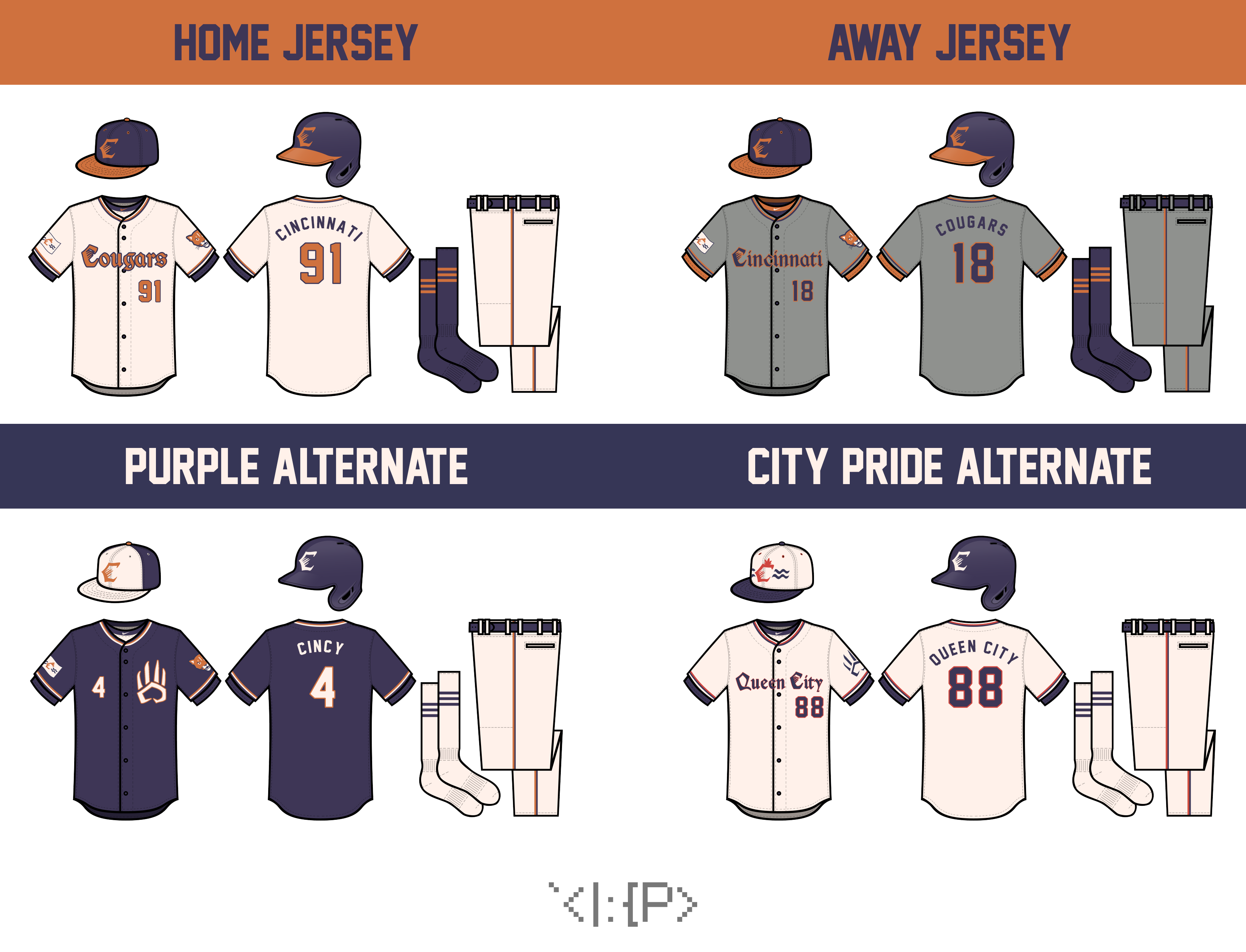
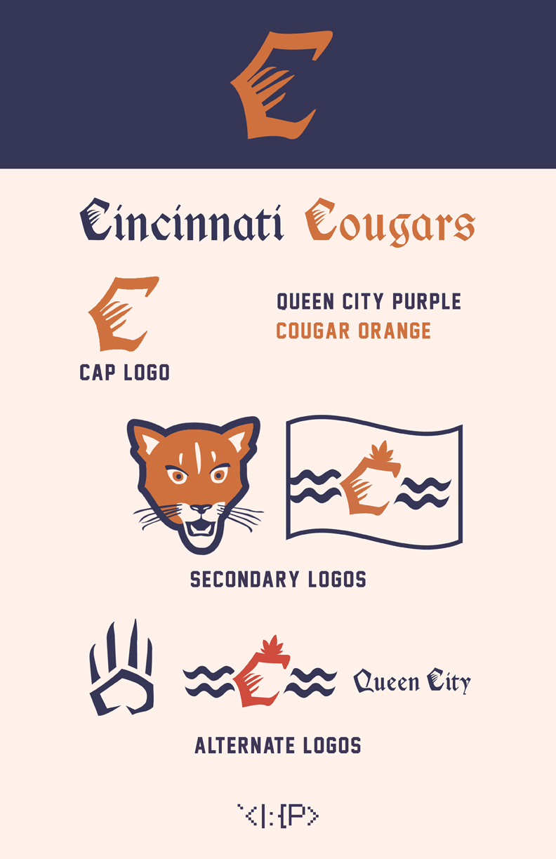
I just finished up another brief graphic design class, and made this concept as one of my projects.


cincinnati_presentation_001.jpg


jersey_presentation_001.png

The font for the wordmarks is Cimbrian, but I made the C's and Q's from scratch to closer resemble my cap logo. The number & name font is Jersey M54. And since this class gave me access to Photoshop CS6, I got my first chance to use @rsaline's very pretty (albeit a bit confusing with all the smart objects) template. The jerseys are pretty plain because this was my first go at it...


The goal here was to make a team in a sorta similar style to the Detroit Tigers, with the blackletter font and different cap logo C from the wordmark. The colors are meant to be an old-school adaption of FC Cincinnati's.


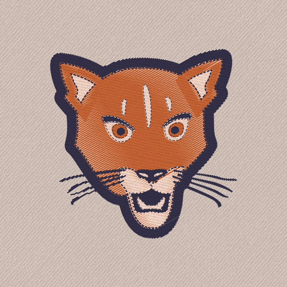
Finally, to try out some more Photoshop features, I made a patch version!

cougar_logo_patch_jmelmon_001.png


Any suggestions are appreciated, but it might be a bit before I get access to CS6 again... Still, let me know what you think! Thanks!


NFL Fields - 2015 Chargers throwback (2/10/18)

$
0
0

All fields here, and more, can be found on the Gridiron Fields Database.


Links to fields


Bears       1944 2016
Bengals     2016 2017
Bills       1991 1992-1993 1994-1998 1999 2000-2002 2011-2014 2015 2016
Broncos     1974 1998 2016
Browns      1986 2016 2017
Buccaneers  1991 2016
Cardinals   1988 2008-2014 2016
Chargers    2009 1987 2016 2017
Chiefs      2003 2004-2007 2008 2009 2010-2014 2015 2016
Colts       2015 2016
Cowboys     1996-2002 2015 2016
Dolphins    1985 2016
Eagles      2016 2017
Falcons     2008-2014 2015 2016
49ers       1981 2016
Giants      1964 2015 2016
Jaguars     2016
Jets        2015 2016
Lions       1980 1989 2001 2016
Packers     1994 2015
Panthers    1998-2003 2012-2013 2014 2016
Patriots    1973-1983 2006
Raiders     2016
Rams        1977 1987 2016
Ravens      2000 2008-2014 2015 2016
Redskins    1943 1987
Saints      2015 2016
Seahawks    2015 2016
Steelers    1972 2015
Texans      2016
Titans      1993 2016
Vikings     2008 2009 2010 2011 2012 2013 2014 2015 2016


Links to Playoffs Fields


Links to International Series Fields

Spoiler

2016

Week 4 Week 7 Week 8 Week 11


2017

Week 3 Week 4


Now that I've been working with the Gridiron Uniforms Database to help add fields to the Gridiron Fields Database I'll be starting to do some historical fields, along with the current ones. There are so many past fields to do, and they are time consuming, so at least to start with I'm going to do just fields for big moments in NFL history. So I'm starting with the immaculate reception game. I'll also be skipping the on-field logos portion, to save time and memory space.


December 23, 1972 - AFC Divisional Playoffs

Raiders -7    @    Steelers - 13

WqRxDDU.png


December 31, 1972 - AFC Championship

Dolphins - 21    @    Steelers - 17

aqkBsiC.png


As always, if anyone wants templates or the full sized fields (9144 x 4344 pixels) PM me.

Silent's Sports Signatures - All Sports Championships & "Where I Come From" (WNBA added!)

$
0
0

One of the primary things I've worked on while a part of this community is sprucing up people's signatures. I greatly got off track, and while I also have other projects that are still hanging in limbo, I've been getting messages for some time requesting I return to my work with signatures. As I had two threads in the past, I've decided to merge everything into one new thread and get a fresh start, fixing the mistakes I've made in the past, so let's open up shop.


Instructions on adding signature images

These are for anyone to use in their signature if they desire. To add them, click the arrow next to your username in the upper right corner and choose "Account Settings".   Click the "Signature" tab on the left and under the text field hit the "Insert other media" button and select "Insert image from URL".  All you need to do is right click the image in my post, select "Copy link address" and paste it in the window that pops up here.   Enjoy! ^_^


All Sports Championship Signature Images

My original signatures thread, this was based on some images I'd seen in someone else's signature. I decided to make my own version with a more simplistic style, and then to offer my services to anyone who was interested. Here's a sample of my work, my own image from my own signature, which consists of the championships of the Yankees, Mets, Dolphins, Jets, Giants, 'Canes, Black Knights, Rangers, Habs, Bulls, Knicks, Nets, and my very own Yahoo! Fantasy Baseball team.

qn5r1t.jpg

Just tell me what teams you want to be included and what levels of championships you want to be included. Do you want all world championships? Do you also want divisional or league/conference championships? Do you want bowl wins or scoring trophies? And if the team has existed in multiple cities, let me know which cities you want included? Do you want the Braves' entire existence, or just their time in Milwaukee?


Here's a sample of some of the trophies that are available, but I will do anything I can to accommodate everyone. Images of the championship prizes of more obscure leagues are very helpful.

2vt1edi.jpg


156u8gx.jpg

With the change to a new Paint that is a huge step down from the Vista version, I've had trouble working on these and STLgent came in and sort of took over. Unfortunately, he hasn't been around for some time, and I've been getting a lot of requests to resume, so I'm going to do my best to work things out.


"Where I Come From"

I've always been intensely interested and had a great love and appreciation for the different cultures in sports, which, of course, includes the logos and uniforms, leading me to this website.


One of the things I really loved, which was used for one year and then seems to have completely disappeared from memory and the internet is NCAA Football 2011's ad campaign featuring the slogan "Where I Come From". In the commercial, different people described things where they came from, giving little snippets about their sporting culture. At the moment, I've only found videos of the commercials surviving on a french video site and one extremely low quality video on Youtube.

General Version: http://www.jeuxvideo...-1-00028354.htm
SEC Version: http://www.jeuxvideo...-2-00028355.htm
Big 12 Version: (Loud audio warning.)

I'd often thought of doing the same for other sports. Originally, I made a full list of phrases for the MLB, and tried making signature images to go with them, but my early attempts were rather pitiful. I, however, took another crack at it, and the thread became a rather booming affair that I think inadvertently caused the change that currently causes signature images to be automatically shrunk (some people featured upwards of four or five at one time). >_>;


My original versions, especially some of the very first ones I did became a bit of an old shame for me as I consider how much better the quality has grown with my experience. I also rushed to get stuff out, and I remain kind of embarrassed by some phrases I came up with quickly in instances where I couldn't think of anything. So, I decided to take this opportunity to remake everything I've created thus far. Consider it an HD remake. I hope everyone enjoys the new versions. People who already have the original versions can update if they wish, and new people can pick them up if they wish.


I also made a few videos to show off my process for anyone who may be interested.


Each image consists of five separate images: one of the team's home city, one of their home venue, with the teams logo in the center. The other two are different for each sport. If you'd like anything special, make a request. In the future, I wouldn't mind doing the other sports as well. And yes, they're all positive ones. For some, it was tough finding something positive, but I think I've succeeded. You're welcome to link me to images that you want me to use if you have special requests.


Here's links to all of the images I've created thus far:

MLB - Eastern Divisions | Central Divisions | Western Divisions

NFL - Eastern Divisions | Northern Divisions | Southern Divisions | Western Divisions

NBA - Atlantic Division | Central Division | Southeastern Division | Northwestern Division | Pacific Division | Southwestern Division

NHL - Atlantic Division | Metropolitan Division | Central Division | Pacific Division

MLS - Eastern Conference | Western Conference

CFL

WNBA - Eastern Conference | Western Conference

NCAA Football - ACC Atlantic Division | ACC Coastal Division | Big Ten Eastern Division | Big Ten Western Division | Big XII | Ivy League | Pac-12 (Part 1, Part 2) | SEC Eastern Division | SEC Western Division | Service Academies and Independents | Mid-American Eastern Division | Mid-American Western Division

IIHF Big Eight

NASCAR Drivers

English Premier League (Part 1, Part 2)

NCAA Basketball - ACC (Part 1 , Part 2) | Big East

PGA Major Tournaments

Thoroughbred Triple Crown

FIFA Men's National Teams - Asian Football Confederation | Confederation of African Football | Confederation of North, Central American and Caribbean Association Football | Confederación Sudamericana de Fútbol | Union of European Football Associations (Part 1, Part 2)

MLL

NLL 

WWF/WWE (Part 1


Enjoy everything, and as long as I don't get banned for my thirty-three-tuple post, let me know if there's any requests you have for me.

Atlanta Braves Road Uniform

$
0
0

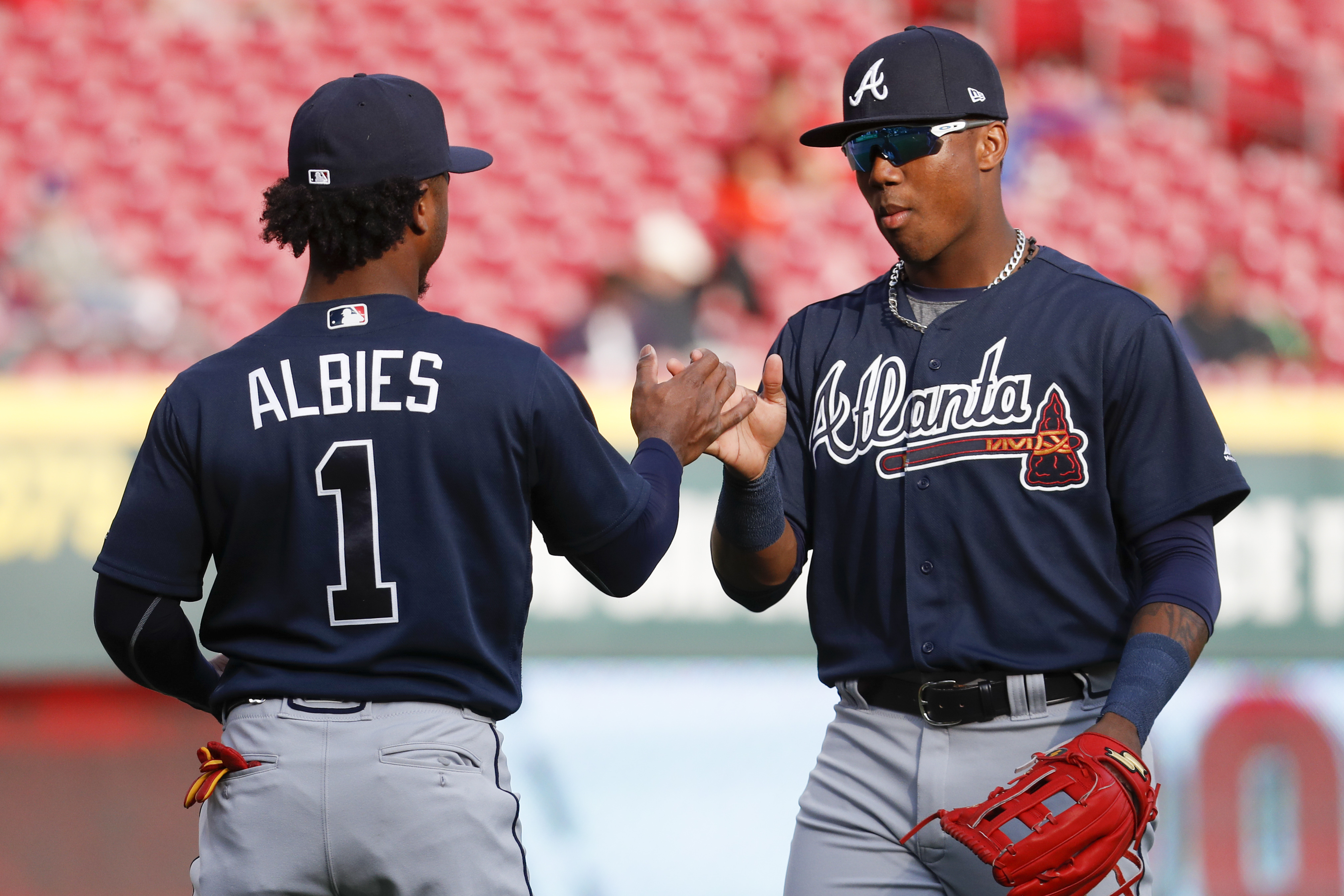
To start, I want to say that in 2008 when I was a young high schooler, I thought the current rendition of the Navy Braves road top was awesome.  I mean, what was there not to love about the outlined(?) script and numbers to a 14 year old kid?  It was what all of the high schools seemed to be doing at the time, and now my favorite big league team was hopping on.  Ten years later, though, and I find myself irked by it.  At the risk of sounding like one of those old cliché, traditionalistic talking heads, I have to say it.  It doesn't (at least to me) look professional, something that as I have gotten older I have grown to appreciate.  Spring Training rendition of it? Heck yea, why not?


HtnumVJ.png

Atlanta Braves Navy Spring Training Top. GOOD


But your go to color top on the road during the regular season (and the ONLY Navy option), not anymore.


5f6c4b55-ae4b-4c1a-8394-1d950ad82a9b-AP18115838679038.jpg

Atlanta Braves current Road Navy Top. BAD


I don't know, I may be in the minority here.  But "Bush League" qualities aside, it really does irk me that the script "A" on the cap is solid white, but just below it the same exact "A" in "Atlanta" is Navy with a White outline.  I for one would just love some consistency.  So, no more griping, but that's what prompted me to create a new concept.  I'm hoping with Nike set to take over the MLB in 2020, here's hoping my Braves take the opportunity to update this out of date set.


What I propose are two options.  The first of which would allow Atlanta to keep the current All Navy Road hat (which I will openly say I am not a fan of, especially when there is a MUCH BETTER design in the not-so-distant past that will be part of my second concept option.


HtnxCVw.png


Now, I will admit.  This was a much easier concept to make happen in my head, only due to the simple fact that I didn't account for the Tomahawk.  I mean, it was always there, I just never thought about how it would work with a solid White only "Atlanta" script to match the current Road hat, which is the entire point of this one.


The second option I will say that I have complete bias towards, solely for the fact that I am a homer for the hat option, and have been for the entirety of my Braves fandom.  Remember that wonderful Tomahawk "A" hat with the Red bill the Braves used to sport with the glorious Red tops (and not those heinous star filled ones either, I'm talking the original with Tomahawk under the script, but that's a whole different conversation)? 


ff_2670491alt2_full.jpg&w=600 HtnBra6.png


                                                                                                 BAD                                                                    GOOD


Yea, me too.  But anyway, back to the hat.  So why not bring it back, but as the inspiration for a Navy jersey?


HtnyjSP.png


While the jersey itself is still slowly growing on me, the hat itself in my opinion makes the move absolutely worth it.  What do you think?  C&C please.  Let's help make Atlanta great looking on the Road again. (Though snapping this 4 game skid wouldn't hurt, either)

NIKE X NBA JERSEY CONCEPTS (HOME) 2017-2018

$
0
0

Since Nike is going to be the new jersey supplier for the NBA I made some concepts to show my take on the new jerseys. I used the USA olympic jersey featuring a nike vapor jersey and made my own mockup on it, to get the realistic stitching details on the numbers and logo I used a photoshop action called realistic stitching action to make it look realistic as possible. I hope you guys enjoy!

rsz_atlanta.thumb.png.4f8994a2f9dd8b30883de76825aa2d86.png

rsz_boston.thumb.png.6a3d7baabe1dc0df774b6866b104ae21.pngrsz_brooklyn.thumb.png.88340b44c3a9bfd847d5e5625a2abcc2.pngrsz_charll.thumb.png.a5db1399cc50a42ba0d3e536f70dac2f.pngrsz_chicago.thumb.png.7ac7faccec61dcbe54fb18f8d80d852c.pngrsz_1cleveland.thumb.png.a2bc1fd0e1bd1247d47234a3c7702c21.pngrsz_dallas.thumb.png.c5a0e39fe1734eaa3ed8ea17c6fa88f7.png

rsz_denver.thumb.png.2058413ab2b257eca77c4f8d39e6de85.pngrsz_detroit.thumb.png.ebb480687f92495adcc336fbb5269e5a.pngrsz_goldenstate.thumb.png.c3d09c9632d02dc098a25ab5ba59b279.pngrsz_houston.thumb.png.bdfdc4e1e690c325f68656fc6aaba849.pngrsz_indiana.thumb.png.4296080168d19d748cae52dae3d337f9.pngrsz_lac.thumb.png.0c0e2cdc173ed1963ab38b6033cb8a3a.pngrsz_lal.thumb.png.e260696ba284ce8006adf0d64a28ac32.pngrsz_memphis.thumb.png.fadc4010f7f4f4fe283464b30c5288ac.png


Half way done the other half of the NBA will be uploaded as soon as possible. Feedback would be helpful!!


NBA | Indiana Pacers Rebrand | Update: Alternate court design

$
0
0

Indiana_Pacers_color_scheme_update.png


Indiana_Pacers_logo_presentation.png


Indiana_Pacers_primary_logo_detail.png


Indiana_Pacers_secondary_logo_detail.png


Indiana_Pacers_alternate_logo_A_detail.p


Indiana_Pacers_alternate_logo_B_detail.p


Indiana_Pacers_alternate_logo_C_detail.p


Indiana_Pacers_wordmark_logos_detail.png


NBA_teams.png


A complete set of uniforms, plus court designs, will follow in July.


Dallas Cowboys Uniform Concept

$
0
0

I've been working on a cowboys uniform concept for the past couple days, here it is:


gUNGEH9.png


My main goal with the set was to make it more consistent. Their current set uses two different blues for the home and away sets. Their current set also uses different striping on the home and aways. I'm also not a fan of a ton of outlines, so I got rid of the double-outlined numbers and made them a single outline, which on all the jerseys is silver. The alternate is a fauxback using their 1960's design they already use for one of their throwbacks. It uses the modern helmet and jersey striping, numbers.


C&C Appreciated :)

Winnipeg Jets Set

$
0
0


Jets concept - work in progress...


updated 07/08/18  simpler and cleaner minus gradients on logos... uniforms are another story as I've searched for pre existing hockey jersey templates and haven't found any that I really like... so keep working on my own...  However, if anyone has a specific template in mind, will consider it.

MLB by NIKE

$
0
0

NMJMysC.png

With my college hockey season winding down, I find that I once again have time to post stuff on here again. I've started a bunch of projects, but haven't had the time to get them on here until now. I've got a super massive project coming soon, but I wanted to get this one up and going before I consider starting that one. Enough with that though, lets dive in.


I am aware Under Armour will be getting the MLB in 2019, replacing Majestic and Nike, but I really haven't done a baseball redesign series to date (i'm not considering my Pinstriping the MLB a "redesign series"). So I thought I'd give it a go. Now traditionalists be warned. This won't be a run of the mill white/grey/color uniform set for each team. Some teams will stay traditional in that sense, others will be a little off the board. Expect some colored pants. Sleeve stripes will be bigger for most, if not all teams. Traditions will be upheld for some. But that is enough my talking, I'll let the concepts do that instead. I'm going in alphabetical order of teams, starting in the AL. 


7rWc8kI.png


I don't really have a lot of complaints with the current state of Baltimore's uniforms. Hence why there isn't a whole lot changed. I did scrap the grey uniforms in this case. 


-Hats/Batting Helmets - I really really really am a sucker for white panel hats. However I am not a huge fan of the cartoon oriole on the front of the hat so I changed it to the O's logo. Black hat stays pretty much the same. But on the batting helmets I used the cartoon oriole. The O's logo just didn't look right on it. BP hat is orange with the cartoon on it, and it could be snuck into the rotation of hats. 


-Jerseys - Again, not much is different from what is currently used. Orange jersey becomes the new road jersey, and now has the Baltimore script on the chest. Black jersey gains some white detailing and is the new alternate. BP jersey I will have fun with for all the teams. Most teams will have a logo instead of script on them and will have more modern striping. In this case, two BP jerseys for the Orioles, both have the cartoon Oriole and truncated racing stripes. Also, just to be more modern, I added a chest number. 


-Pants -  White pants only for the Orioles. I knocked around the idea of orange or black pants but found it didn't suit the look. Plus I didn't think they'd want to look like oranges running across the field since they've tried that before


C&C welcome as always!

Florida Flamingos C&C Wanted

$
0
0

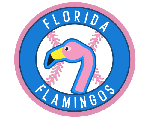
I'm rebranding one of my baseball teams in my fictional league, the National Baseball League, from the Miami Pirates to the Florida Flamingos. I want them to be bright, exciting, Miami-esque and I'm just having trouble getting it to where I want it.

 Screen%20Shot%202018-07-08%20at%203.26.2

Any and all C&C is appreciated. Thanks friends!

NFL to NBA (#12 Lions updated on 7/8)

$
0
0

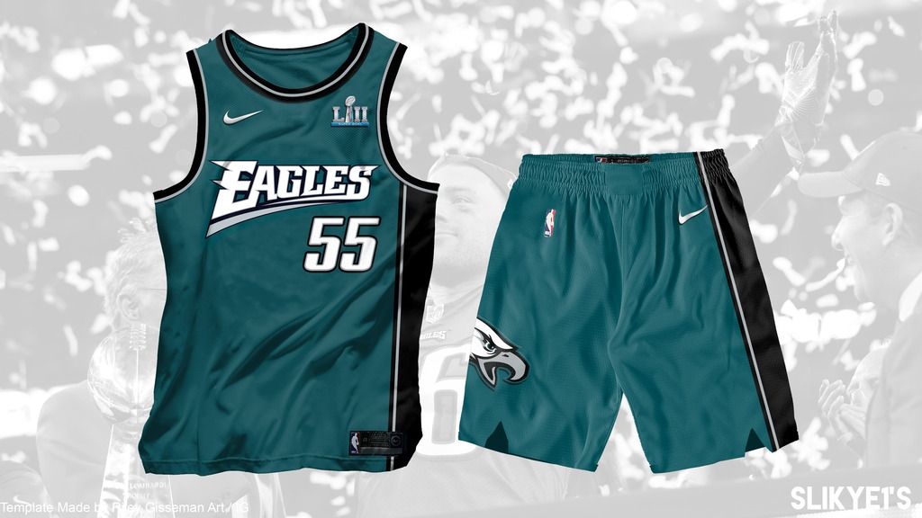
Hi! Not new here but it has been long since I finished my last concept... And now back with a NFL to NBA concept.

First I want to thank  @R3G for his amazing nike NBA template! Very user-friendly.


The 1990s NBA jerseys seem to be controversial because of it's colors and details, and I would like to see how the NFL teams can fit into it. 

Since the Eagles unveiled their current set in 1990s so I decided to start with it.

eagles_zps3p4fkddm.jpg


Inspired by the 1992-95 Hawks set and 1997-2011 Wizards set, which both have single-sided stripe and similar curved jersey logos.

May back with the white/alt or I will start another new team. C&C is always appreciated!! Thanks for reading!!


2019 NHL Centennial Classic Concept

$
0
0

HJC just finished their Pairs Comp, And I teamed up with fellow designer Burkus Circus for an idea for a 2019 Centennial Classic doubleheader. The main idea is that the NHL is helping the Packers celebrate their centennial season by playing two outdoor games at Lambeau Field. First, a College matchup between the Golden Gophers and Badgers, then an NHL showdown between the Blackhawks and Wild. I designed the Event Logo, Ice Surface, and Slideshow, while Burkus Circus designed the jerseys and title page.


Disclaimer: I have received full permission from Burkus Circus to display our work here.


3xMmOJq.png

Pi2CX3c.png

0QI1Fx6.png

VGeNeW6.png

meM6zAx.png

Thanks for watching!

NBA Soccer Crossover

$
0
0

Atlanta Hawks:

ZGaghPV.png

uWRJd1U.png

For the Hawks I got rid of the charcoal and volt, and carried over the hawk feather pattern.


Anyone wanna finish these? & add a white one...

(UPDATE 5/4/18) NHL uniforms done on NHL '18

$
0
0

- I still haven't come around to getting any good at doing jersey concepts via templates so I decided to do my project on NHL '18.

- Due to the limited amounts of jersey styles, not all of these designs are 100% how I would have them if I had complete control over those aspects.

- I have things pretty close to where I'd like them, and I will leave notes explaining any instance in which I would have liked something a bit different.

- I didn't do every team in the league, only those that I felt had really bad jersey layouts, or needed a color change / tweak.

- I tried to eliminate white from most of the uniforms because I wanted to do things a bit different and white just seems like too easy of a security blanket to use.

- Teams are in alphabetical order


- - - - -

ANAHEIM DUCKS

(Edited 4/29/18)

* Lightened the green / changed alternate to have more orange in it.

* Made the lines thinner so that the away jersey wouldn't have a different thickness compared to the other two.

(Edited 5/1/18)

* Gave the alternate green in the glove, and on the helmet for the manufacturer name.

(Edited 5/4/18)

* Added white.

* Due to adding white, I darkened the green.

NOTES:

- I have seen at least 2, maybe more concepts for the Ducks that have used green and orange. I tried to run with that, and create a new identity for Anaheim.

PROBLEMS DUE TO THE LACK OF OPTIONS IN THE GAME:

- The teams original logo is not available to use in customization, so I wasn't able to play around with that and was forced to use their current "Webbed D".

- I tried implementing white into the Home and Alternate, but just couldn't really find the right fit. This may have been due to the limited jersey styles, and I couldn't quite get the thickness of the white lines that I wanted.

w7bkv6.png11t5x7d.png2i1p01e.png


ARIZONA COYOTES

(Edited 5/1/18)

* Added more of the dark red to the home with thin lines.

* Gave the alternate a logo with the sand colored outline.

(Edited 5/4/18)

* Added white.

NOTES:

- I wanted to go with the sand color as the primary to give the Coyotes a unique look and go outside the norm. Some will probably argue that the alternate should be the home, but I like it this way.

PROBLEMS DUE TO THE LACK OF OPTIONS IN THE GAME:

- As with the Ducks, the teams original logo (the standing coyote) isn't available to customize, but I actually think the current logo fits nice with the way the jersey is set up here.

2wd7xqb.png1ie8n5.png212br80.png


BUFFALO SABRES

NOTES:

- For the Sabres, I wanted to create a new identity with the color scheme, while using the original logo to keep the team grounded in their history. 

- The colors of the "San Diego Rampage" were used. Dark blue, grey, and white.

1zcfrww.png316ai38.png2uqp1s7.png


CALGARY FLAMES

NOTES:

- I brightened the red, and mellowed the yellow.....

- The home jersey now features a yellow C

- I wanted to alter the Flames because I hate the fact that they have now gone with a black C, and while I love the original jersey design and colors from the 80's (and before via the Atlanta Flames) through early 90's... I wanted to give my own spin on this classic look with different shades of the teams colors.

68srcw.png2krcw1.png


COLUMBUS BLUE JACKETS

NOTES:

- I'm not a fan of the Blue Jackets current logo, jersey or color scheme (becoming the 5th team in the league to use red, white and blue), but since NHL 18 has this jersey (the old Might Ducks layout?) I thought it would fit their logo pretty well.

- I smoothed out the logo some, trying to make it a little better. Maybe it's better? It's definitely different than before.

PROBLEMS DUE TO THE LACK OF OPTIONS IN THE GAME:

- There is only the one logo to chose from, and none of the custom logos made for a good Blue Jackets theme. Would have loved to use the cannon logo, but at the same time, that one wouldn't go so great with the jersey style.

(Edited 5/4/18)

* Revamped the entire jersey with more white on the home, thickened the lines on away to match.

* Lightened the blue.

wr9u.png33ucok7.png


FLORIDA PANTHERS

NOTES:

- Not a fan of the new 'Montreal-type' jerseys they went with, so I started messing around and found a style that I really liked.

- I wanted to switch over to orange for the Panthers because well.... Florida Oranges!

- I may go back and swap out the orange for the red that they use, I mean the Islanders and Oilers already use blue and orange,  but I couldn't help myself here, I just love the shades I used, could just be me though.

eb3bqb.png2rmnt03.pngr1kec1.png


LOS ANGELES KINGS

NOTES:

- Pretty obvious here that I implemented purple back into the color scheme and changed the jersey style from the current one the team uses.

2j84fa.png14t6j3t.pngnygsy8.png


MINNESOTA WILD

NOTES:

- Nothing to really say except since I don't really like the Wild's new "Montreal Style" jersey, I tried to give them a better, more balanced look.

a2x307.png2zow1z8.png


NEW JERSEY DEVILS

NOTES:

- There is just something about the Devil's uniforms that I don't like so I wanted to put my spin on things.

- I went with the white logo on the home because I feel it balances out the entire uniform the way I have it set up... I'm not sure how this is going to go over though.

- The alternate jersey feature a brighter red than the home and away. This jersey went over really well with Devil's fans on the Facebook hockey group I'm a part of.

PROBLEMS DUE TO THE LACK OF OPTIONS IN THE GAME:

- Back to the logo. I went with the white logo because of the balance. I wanted to have a thicker outline around the RED devil at first, but the game just didn't allow it. The outline that they do allow is just way too thin, and I couldn't find any look that was balanced.

33yl3wk.png2h7jsk8.png1087dki.png


OTTAWA SENATORS

NOTES:

- I wanted to go for a look that would say the Senators are trying to be taken seriously from here on out, and want a brand refresh. I also didn't want to have more bright colored red (New Jersey, Calgary, Carolina, Detroit, Montreal, Chicago already have that *I left out Florida and Washington, because in my universe I have changed their colors), so I decided to go with a black home, and have the dark red as an alternate.

- I chose the "O" logo because I felt it completed the overall look that I was going for.

w0ntpk.png2vk1f2o.png308l7js.png


PHILADELPHIA FLYERS

NOTES:

- I'm a Flyers fan, and while I respect the fact that the team likes to pay homage to the old school Flyer teams, and manage to keep their jersey styles in that same sort of tradition... I don't think they use nearly enough black, especially for a team that the local media and fan-base call by one of their nicknames "the orange and black". Here is my take on what I would personally like to see...

- I love the alternate I came up with, but I can also see if it doesn't go over too well due to the alternation of the logo.

- I also changed the shade of orange, it's now less "traffic cone orange"...28tc5me.pngiog31t.pngf4r29t.png


SAN JOSE SHARKS

NOTES:

- For the Sharks look, I went outside the norm here. For me, I love it. For probably most traditional people, they will probably hate it.

- The jersey now becomes the background of the uniform, and the pants, gloves, helmet, and some of the logo become the focal point of the entire thing. This might bring jersey sales down, but I'm sure they could come up with some way to counter-balance that....

fve5v9.png9bepvr.png


ST. LOUIS BLUES

NOTES:

- I really was just messing around with different combinations of blue and yellow, and this is what I settled on. I'm not a fan of the real life blues jersey, and I feel that these ones compliment the logo better, but I could be wrong.

v2r3fn.png257g4rl.png2wcpco1.png


TAMPA BAY LIGHTNING

NOTES:

- I wanted to get the Lightning away from the (pretty much) same shade of blue as the Maple Leafs. Not to mention they both only use blue and white.

- Personally, the the blue might seem too "soft", but the way it's displayed in the game, it really pops.

- I kept the jerseys as close to the same exact ones they real club uses.

2hreowp.png1zqsshv.png1zgeszl.png

VANCOUVER CANUCKS

NOTES:

- Added a little more white to the uniform, and had put green around the logo, plus switched the jersey up a bit.

- I kept trying the other logos and dark blue pants but ultimately decided this setup looked the best.

1532q75.png2ag6l34.png

WASHINGTON CAPITALS

NOTES:

- Got rid of the overused red white and blue scheme and took the Capitals back to the days of when they had blue and gold.

- The "Weagle" didn't look right, and although the flying eagle has its flaws (only one leg) it still evokes movement and looks the best out of the game-supplied logos. 

2pr9vky.pngzno2lg.png

72Freebie's NLL Redesign (Calgary and Philadelphia added 11/11)

$
0
0

Hey Everyone, I'm Back! I've been wanting to start a new concept series on here forever but I just haven't had the time. My schedule is starting slow down a bit so I thought i'd do a quick series for something I've never done before. Lacrosse. I love watching the NLL whenever TSN decided to air it and I've always thought that the jerseys in the league were great because they don't have as many rules or boundaries as say, the NFL. many designs in the league still look like they are out of the 90s and I hope they stay that way. Anyways, I've never really tried designing Lacrosse uniforms before but I am taking a shot at all of the current teams as well as the team from San Diego that is entering net season. 


Lets start with the Rochester Knighthawks

5uKU9bS.png

Circular Brackets

$
0
0

I remember another user here coming up with this idea a couple of years ago, but I can't for the life of me remember who it was or come up with the right search terms to find the old topic. But here goes anyway ...


Given that it's playoff time in the NBA and NHL, and a recent work project got me thinking about presenting data in different ways, I was messing around this morning with circular brackets. I'm wondering which version everyone likes better: where the colours fade in toward the middle (20% of a team colour in the first round, 40% in the second, etc.), or the one where they're solid throughout.


FYI - this is just a chalk version of this year's NHL Playoffs for example purposes and should not be taken as any sort of prediction.


rH2gbNh.png


xAbnQUU.png

ldconcepts' NHL Redesign 3.0 (Bracket Updated)

$
0
0

PLAYOFF BRACKET (V2) (V3) (V4) (V5)


Anaheim Ducks

Arizona Coyotes

Boston Bruins

Buffalo Sabres

Calgary Flames (Update)

Carolina Hurricanes (Update 1 ) (Update 2)

Chicago Blackhawks

Colorado Avalanche

Columbus Blue Jackets

Dallas Stars

Detroit Red Wings

Edmonton Oilers

Florida Panthers

Los Angeles Kings

Minnesota Wild

Montreal Canadiens

Nashville Predators

New Jersey Devils

New York Islanders

New York Rangers

Ottawa Senators

Philadelphia Flyers

Pittsburgh Penguins

San Jose Sharks

St. Louis Blues

Tampa Bay Lightning

Toronto Maple Leafs

Vancouver Canucks

Vegas Golden Knights

Washington Capitals

Winnipeg Jets


With the first regular season of Adidas' reign as the NHL's jersey supplier wrapping up, I've decided, once again, to give each team brand new uniforms. These aren't my ideal takes, but rather something new for each team.


We'll start off with a classic team whose look isn't going to change in real life any time soon, the Detroit Red Wings.


Detroit+Red+Wings+Concept.png


For years, the Wings have employed a very simple striping pattern, which totally works for them.  However, they used to wear numerous complex patterns, which suits their logo well. I was inspired by their Falcons uniforms, but made the pattern a little more uniform, and employed it to the home jerseys like they use them now. For the away jerseys, I kept the red upper arm fill to preserve some of their current look. I also tried to improve on their current collar treatment by adding a white outline on the away jersey.


What do you think? C&C Appreciated!


Viewing all 12125 articles
Browse latest View live