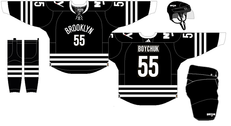
The New York Islanders black alternate jersey is one that I actually like. Now, I know many don't like it, probably because it's such a shift from their regular kit, which is one of the reasons why I like it. However, I do believe some changes need to be made. For reference, here is the current Islanders alternate.

Now, there's a few thing that bug me about this uniform, despite loving the idea of it. First, I think the Islanders are an organization that seems to embrace their past rather than their future, with their future being Brooklyn (probably.) With that in mind, I wanted an emphasis more on "Brooklyn" (without the element of hipsters) than I did on the New York Islanders of 1980-1984. Namely, the striping changed from four skinny stripes to three thicker ones. I also eliminated the "NY" on the pants and replaced it with the "BKLYN" logo that the Islanders have on their alternate helmets (which I strangely love.) I also decided to adopt the Brooklyn Nets font for their names and numbers. The collar has been changed to a more traditional style instead of the "black AND white" style collar they currently use, or whatever you want to call it. I kept the side jersey tags with the "B" logo on them, since I do love them. I updated the jersey style to Adidas, because why the hell not? Anyway, here it is.
C&C is welcome as always. I'm working on a number of alternates for different things, so hopefully I can inject the "Concepts" forum with more of my work.