Like most, due to Adidas' ownership of Reebok, I do not believe many drastic logo changes will come to the NHL logo-wise. I believe most teams will see either recolors or promotion of alternates to primaries, with only one or two teams receiving full on new logos. However, here are my ideas/suggestions regarding logo changes for both the Pacific Division and the Metropolitan division.
PACIFIC DIVISION:
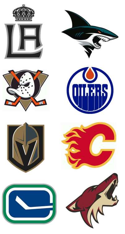
LA Kings: I see the Kings keeping their current color scheme but this is a mixed concept that I made. It involves a mix of their rarely seen stadium series logo and the old crown from the franchise's inception, rather than the dated and complex current crown. This could work as either an alternate or (preferably) a primary.
San Jose Sharks: I see the shark's new alternate logo for 2016-17 ready to take over the current sharks logo. This and the Panthers logo were the only all-new non-anniversary logos introduced this year, so I see it promoted to the primary. It is an improvement over the previous logo.
Anaheim Ducks: This is the logo change I and most really want to see: the duck mask must return. Strip it straight from the already used alternate and promote it to a primary and demote the "D" logo down to an alternate.
Edmonton Oilers: This logo is either staying the same or, in my opinion, getting a minor recolor to give it more of the classic look.
Vegas Golden Knights: This logo was unveiled earlier this year. I'm not much of a fan, but it is what it is.
Calgary Flames: Black will be removed from the team's color scheme entirely, reverting its colors back to the much preferred older color scheme.
Vancouver Canucks: I think either the orca logo stays or, preferably, the classic canucks hockey stick "C" makes its way as a primary.
Arizona Coyotes: No changes.
METROPOLITAN DIVISION:

New Jersey Devils: Although a new logo is rumored for the Devils, I don't see their classic NJ icon leaving anytime soon. If anything, I see their colors being reverted back to red and green to differentiate itself from the many bland red and black teams out there. If they do choose to go with a redesign, I hope it at least keeps the spirit of this logo.
New York Rangers: No changes. Possibly the return of lady liberty?
New York Islanders: No changes. However, the life that this logo has left with the Islanders scheduled to be arena-less in 2019 may be short...
Pittsburgh Penguins: No changes. This recolor was perfect for the franchise and nothing needs to be added.
Carolina Hurricanes: No changes, unfortunately. While the logo is bleh right now, the team has been dead last in attendance and I see relocation in sight. The team will not waste resources on a new logo if the team has no time left in North Carolina.
Philadelphia Flyers: No changes. Very solid and classic logo with no need for change.
Columbus Blue Jackets: I see their much acclaimed alternate logo taking the place of their much derided primary. This is a fantastic logo that better represents a primary logo than their primary logo.
Washington Capitals: I see their word mark logo falling into secondary territory, while their eagle logo gets a few minor tweaks to color and design and gets promoted to the primary. The logo is amazing and its wanted.
Do you agree?
Will add the Atlantic and Central Conference soon...