Not an unpopular opinion... I hate the current uniforms worn by Tampa Bay. Another not unpopular opinion... I feel the uniforms the Bucs wore from 97 to 13 were nearly perfect, and they were stupid to move away from them, especially for the nightmare they ended up with. However, as easy as it is to say "just switch back", I don't really think that's all that feasible. There are a number of reasons why it isn't really done, primarily IMO because it would just feel like an admission that the change was a huge mistake. It was, obviously, but I don't think a franchise would be willing to swallow their pride enough to simple own up to it. Most of the examples that come to mind of a team doing an about face to a "classic" look are like the Giants, the Jets... uniforms that are truly classic in the 40 to 50 year sense. To quickly switch away from a modern uniform to a fairly recent, almost as modern uniform seems unlikely. From a marketing standpoint, I'd think it would be easier for them to sell a return of the creamsicles, as a "classic return"... which I don't believe they'd be willing to do either.
However...
While thinking about it, another model came to mind... that being the 2009 San Francisco 49ers. In '96, they went with their modern update, which was well received at first, but aged very poorly. The darkened red, multiple logo placements, and unnecessary black accents were very "90's" and, especially since it replaced a beloved classic, it wasn't surprising to see the 9ers move back. But they didn't move back completely...


The new uniform, as much as it's thought of as a return of the old, is actually a modern update of the old that owes a bit to the 90'd look as well. It's simplified, and the 90's logo, which is in the forefront of team marketing, is held over.
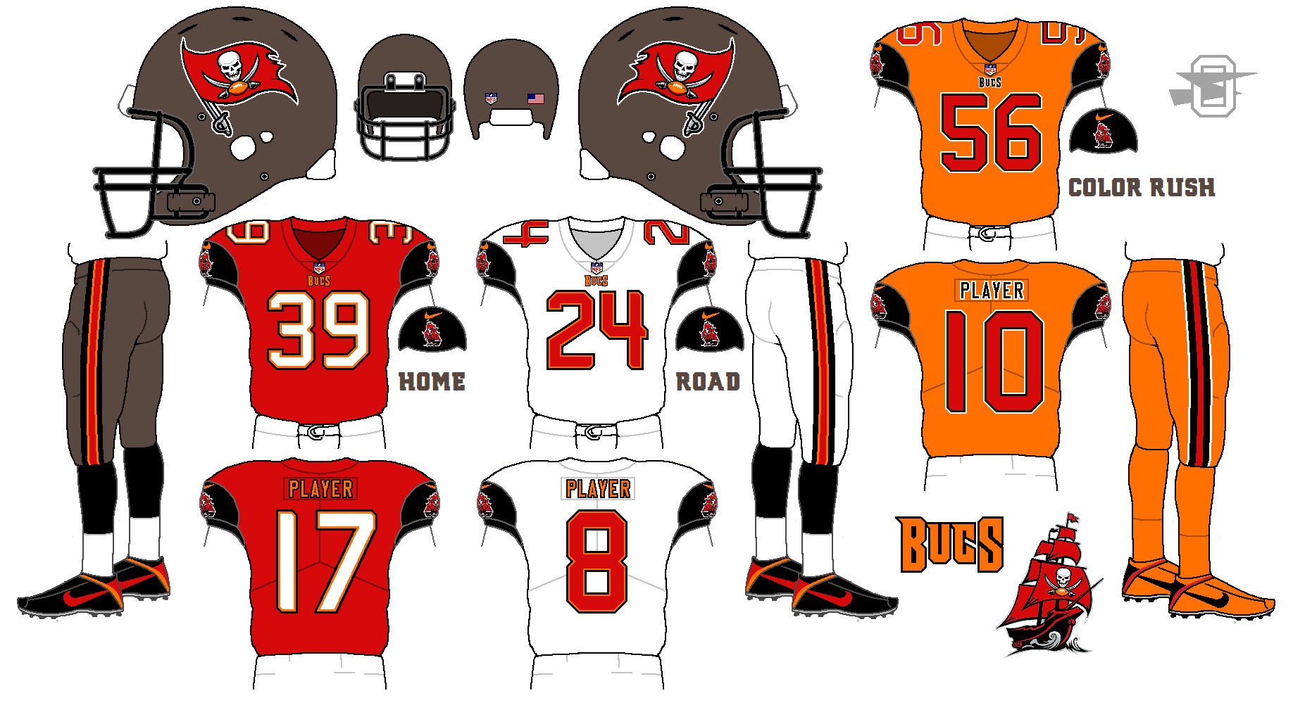
In that vein, here's something similar for the Tampa Bay Buccaneers. Take the uniform everyone loves so much...

... add a few elements from the current uniform (logos, brighter red)

Put it on a more modern template (which eliminates the black collar and cuffs), go with a seemingly more classic but still unique font...
And I got this;

Full disclosure, I actually prefer the older logos, both on the helmet and on the sleeves, but again, my thought was a way to return to a better look without fully abandoning the new one.
Thoughts?