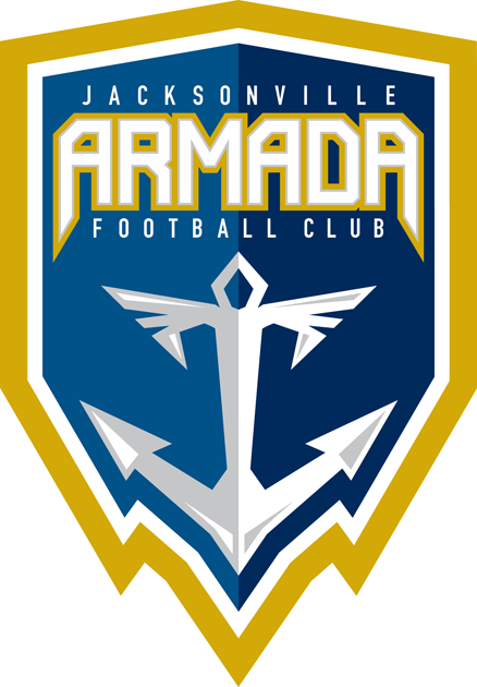
And another soccer club rebrand – somehow I'm in the mood. This time I decided to give the NASL's Jacksonville Armada FC a new primary mark. I'm not the biggest fan of their current identity, especially not of that 1980s typo, but I also dislike that angular-shaped anchor with those wings attached to it. The whole mark looks like it could have been on a cover of some video game 25 or 30 years ago, but it was created and announced in 2014.
I modified the color scheme a bit. Royal blue is gone while gold is now a little more saturated, less dirty. Pantone Cool Grey 2 C is just an accent color for the logo, like in their current mark.

Current logo

