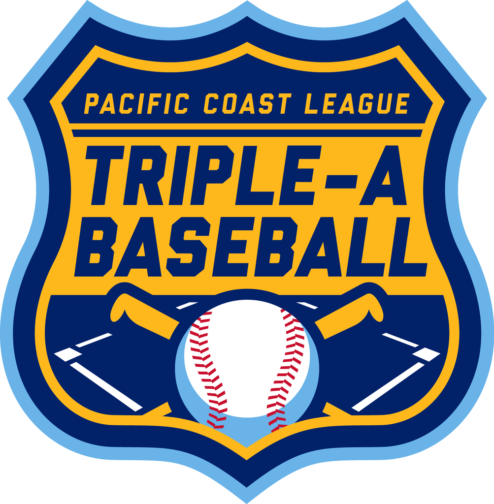
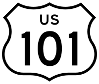
Hi! Here's another redesigned MiLB league logo, the Pacific Coast League (Triple-A) mark. Their current logo is not good, not bad, just generic and mediocre. My redesigned mark has the shape of a U.S. Pacific Coast Highway 101 metal road sign.
The color scheme is pretty much the same.
Link to current logo: http://www.sportslogos.net/logos/view/4798/_Pacific_Coast_League/1998/Primary_Logo