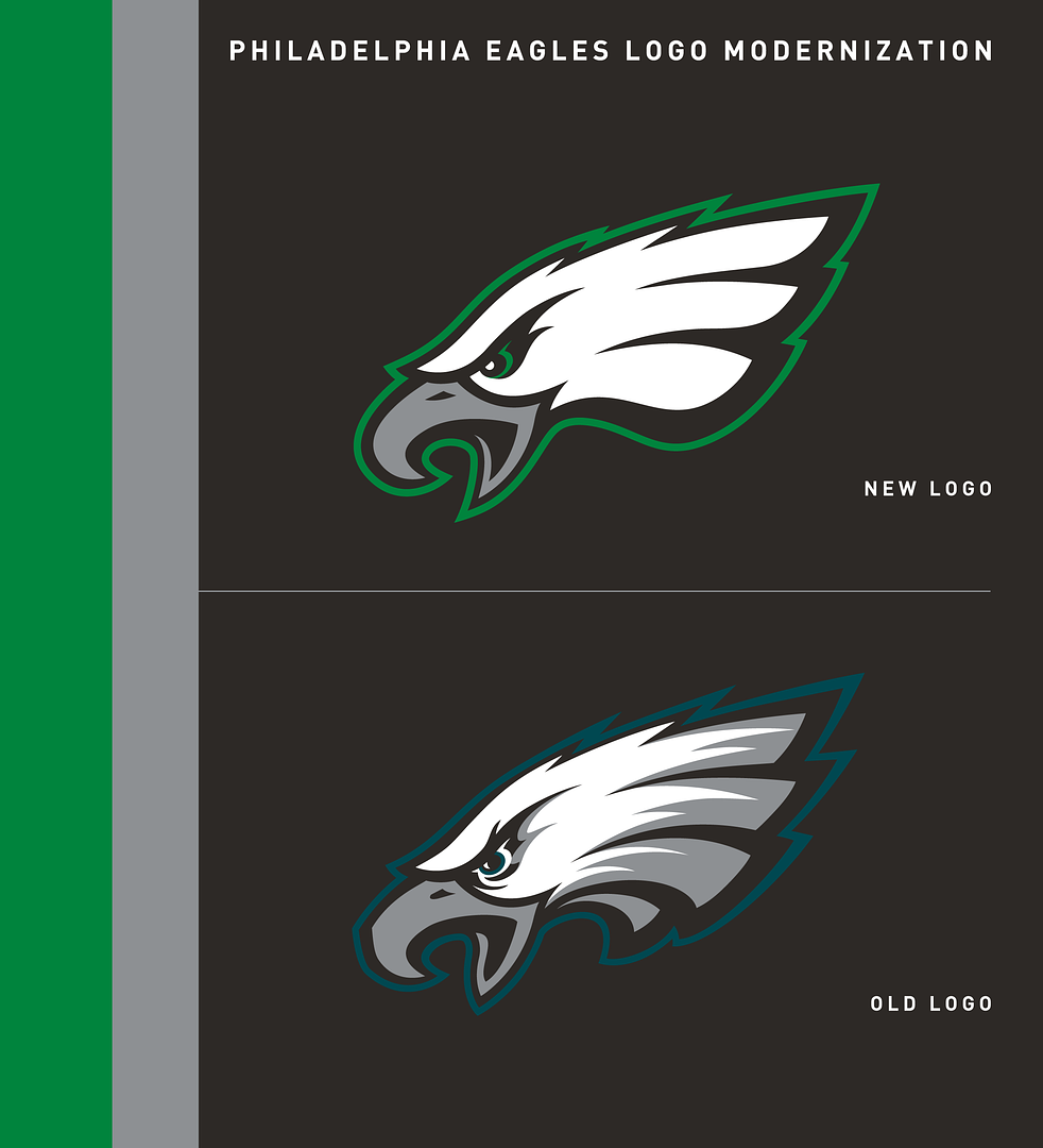
Back with an NFL project, a modernized version of the Philadelphia Eagles current primary logo, the Eagle head.
My intention was to keep the iconic eagle as the team's primary mark, making it simpler and give it a timeless, modern look. Different areas were revised, like the eyes, the beak, the feather lines (which are now only three in order to shape an abstract "E" for "Eagles"). Plus, the Eagles are wearing Kelly Green again – not the exact shade like back in those famous Randall Cunningham years, but just a touch lighter (PANTONE 348 C).
I also recreated the secondary logo with new typeface. The Eagle is still facing right instead of left as in the primary mark. The helmet wing logo remains the same.
UPDATES:
– Green eye added
– Eagle doesn't cover word mark as much as before
– "A" serif in "EAGLES" removed
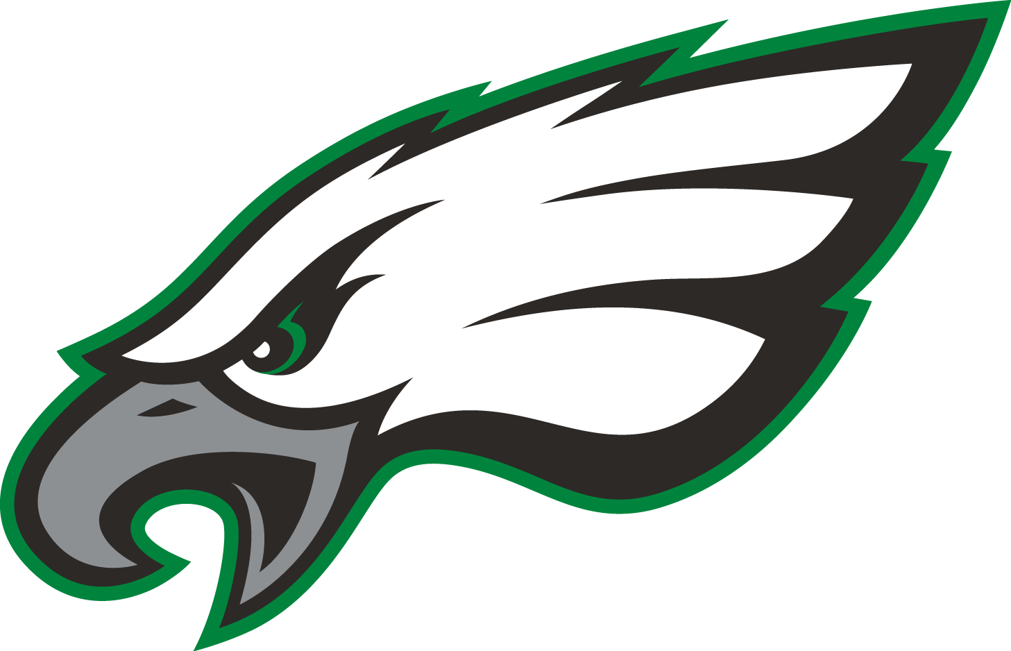
Primary mark
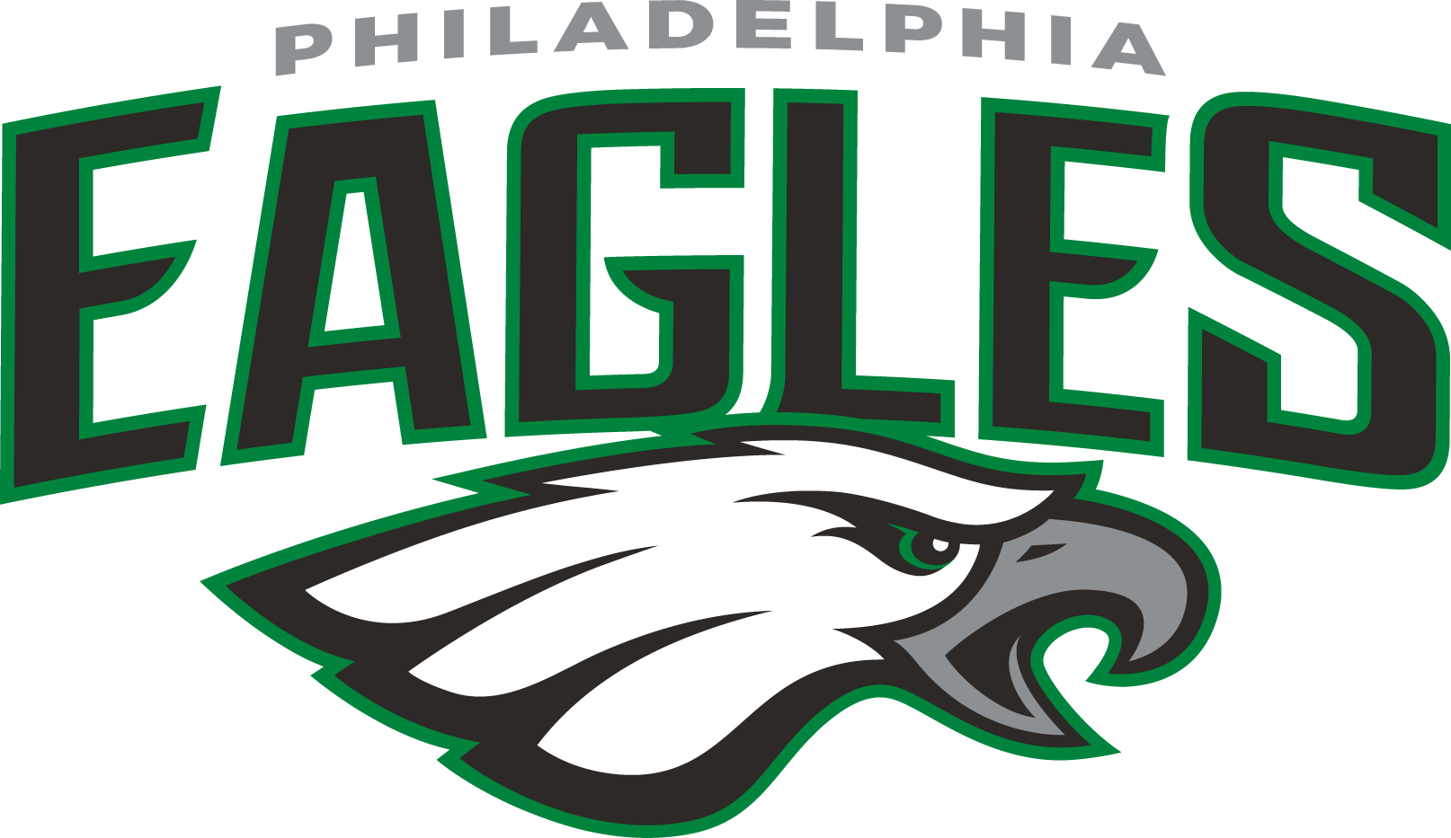
Secondary mark
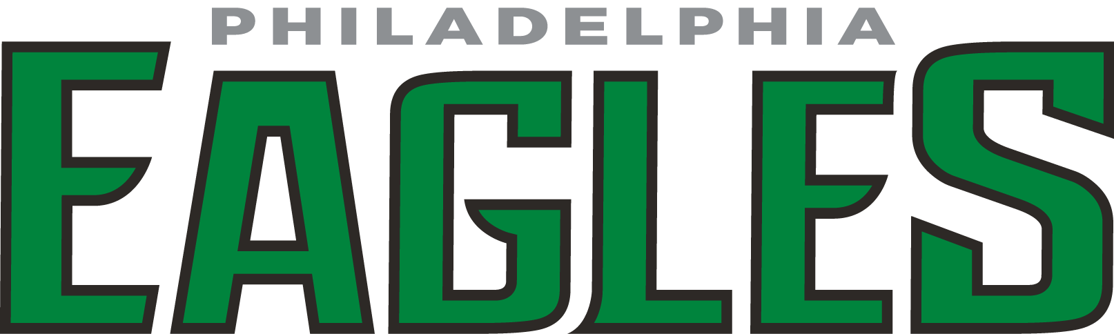
Word mark