Winter break means... not a lot to do so I can try to jump back into some jersey and logo concepts! This is hopefully be a series that will cover every NHL team. Some of them will get brand new logos, not all of them. I'm gonna start off with two rebranded teams: the Blackhawks today and the Avs tomorrow. Often designs I used will be influenced by other designers, and I'll try my best to give each of them credit.
1/30: Chicago Blackhawks
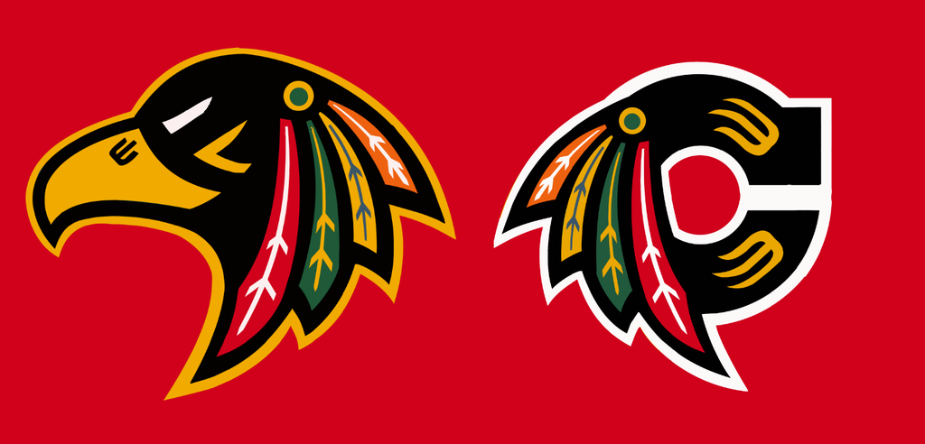
Without having a huge political argument over whether or not the Blackhawks logo is offensive, I've always liked the idea of using a literal hawk in the logo instead of the Chief. This is obviously influenced by Mike Ivall's original design, as well as Brandon Moore's recent crack at it as well. As aesthetically appealing as the old shoulder logo was, I think the tomahawk motif is a bit outdated so I went more straightforward. I chose a path closer to the 60s-90s logo, where in normal application the Hawk has no outline, but on the jersey it has a gold outline.
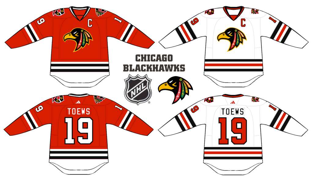
The jerseys are consistent with the ones now, although I changed the numbers on the aways to better balance out the red and black compared to now.
C&C is of course appreciated, and I'll have a new Avs logo and jersey tomorrow!